Showing posts with label logos. Show all posts

Tuesday, November 15, 2011

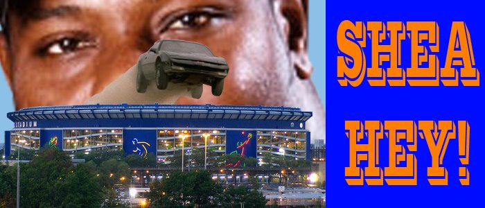
"I'm Calling it Shea" Corporate Stadium Naming Rights Trend Invades the Premier League


My latest for epltalk. Newcastle's St. James' Park is being renamed Sports Direct Arena. But the companies don't pay us anything to call a stadium what they want. We're under no obligation to keep track of mergers and acquisitions to find out what the new name of a stadium is every year. How many names has the S.F. Giants' ballpark had? Anyone know which cities the American Airlines Arena and the American Airlines Arena are in? Isn't easier if we just refer to new stadiums as "(team name's) stadium" and old stadiums by their old names?

"I'm calling it Shea" t-shirts available at the excellent nomas.com

Saturday, February 12, 2011

West Ham United's Potential Move to London's Olympic Stadium

 Got a piece up at Epltalk.com about West Ham's anticipated move to London's Olympic Stadium following next summer's games.

Wednesday, February 09, 2011

England-Denmark Friendly Preview/Review

 I had a post up at Epltalk.com previewing today's England-Denmark match (2-1 to England), but more of an opportunity to show this appropriate crest for the team.

Tuesday, February 08, 2011

Poo-Poo Platter: Super Intense Winnipeg Goldeyes Logo and Phucked Phillies Phainting

Via the always-amazing Uniwatch:
"The logo features a muscular Goldeye fish wearing a red jersey and red baseball cap. He has a menacing facial expression, while gripping a gold bat." 4-rlz.
------
This creepy mural of all-time Phillie greats comes from an obsessive site dedicated to getting Dick Allen in the Hall of Fame:

Friday, January 21, 2011

Review and Concepts for new France Football Shirt

My concept, no swoosh, vintage crest and red cuffs.
My concept, no swoosh and vintage crest
The official new France kit, why so serious?
I've got a new post up at Worldcupbuzz.com which I repost here:


After France’s embar­rass­ing exit from last summer’s World Cup, their Foot­ball Fed­er­a­tion has replaced the man­ager, much of the ros­ter and now their kits. After many years of Adi­das’ wildly-striped designs, new sup­plier Nike has intro­duced a severely sparse shirt. The just-bleu shirt fol­lows a trend toward yes­ter­year led by Umbro, itself a Nike sub­sidiary. Umbro’s recent shirts for Eng­land,WalesMan­ches­ter CitySun­der­land, and Rangers, amongst oth­ers, fea­ture a strong empha­sis on let­ting a club’s pri­mary colours shine and lack the ran­dom pan­els, accented pip­ing and strip­ing endemic to more recent shirt designs. Busy shirts may look fine on the pitch, but tend to look absurd when worn by the man on the street as opposed to sim­pler shirts such as France’s that more resem­ble polo or hen­ley shirts. Except when worn by Katy Perry.

While France’s new shirt is an instant clas­sic that would look nat­ural on such leg­ends as Just Fontaine, the con­trast of the vin­tage shirt design with the thor­oughly mod­ern crest is as jar­ring as an Eric Can­tona press con­fer­ence. So I decided to see how the new shirt would look with­out the dis­tract­ing Nike swoosh, with red cuffs and paired with the vin­tage crest worn by such immor­tals asMichel Pla­tini and Zine­dine Zidane.

Thursday, December 16, 2010

Los Angeles Stickball Logos

Variations on the crest I made below:

Wednesday, April 14, 2010

New York Mets Uniform Changes for 2011

 MetsBlog and Uniwatch reported that the Mets are considering removing the piping from their jerseys for 2011. Took a stab at envisioning what they would look like sans blue piping. Meh.

Friday, March 26, 2010

Wednesday, February 03, 2010

Baseball Hall of Fame Members Should Wear Blank Hats on Their Plaques

 
Lionel Richie played a mean right field.
Andre Dawson will go into the Hall of Fame wearing a Montreal Expo cap, as opposed to his desired Chicago Cub. The 'Spos have one other player in the Hall, Gary Carter. He didn't want to go in as an Expo either, but the Hall of Fame took the choice out of the players' hands a few years back in the wake of rumors that Wade Boggs was willing to take compensation to wear a Tampa Bay Devil Ray cap.

As players from the past 20 years begin to be considered for induction, the cap decision will only get harder. Players like Mike Piazza, Manny Ramirez, and Alex Rodriguez, amongst others, are strongly associated with two teams. Even where the choice is clear, stars change teams far more often than in the past. The only logical step is to have players wear blank caps. Or better yet, no caps at all. In light of some of the more garish modern hats (Blue Jays, Diamondbacks, Devil Rays, Astros and Brewers) it would certainly be more dignified. Moreover, just as players change teams, teams change hats far more often. Several teams wear as many as three different hats. Should Craig Biggio or Jeff Bagwell make the Hall, which of the thirty different hats they wore during their careers in Houston be immortalized on their plaque? Same question for Pudge and the Rangers. NFL Hall of Fame busts don't feature helmets. And, as seen in Joseph Tinker's plaque, not every player goes in wearing a team cap.

Friday, January 22, 2010

The NBA Should Let Both Teams Wear Colored Jerseys During Games


"My colors, my honor, my colors, my all
With my colors upon me one soldier stands tall"

Ice-T-"Colors"
Thursday night's Haves-Fake Show tilt was thoroughly entertaining; capped by a Charles-Smith-esque-sequence where LeG.O.D.D. stuffed Pau "Mr. Uglyman" Gasol, Gasol went up again and got stuffed by Sideshow Bob. The ball fell to Shaq who gave the quick outlet to LBJ. LBJ raced upcourt, paused at the arch, then blasted past three defenders for the layup. Ballgames.

Making the game more of a joy to watch was the visual contrast between the Haves' faux-throwback wine-colored jerseys with the 80's wordmark up against the now-diluted-but-still-classic Fake Show yellow. Compare the 80's Lakers jersey with the current edition. The side-stripes add only clutter while robbing the power of all-yellow. Plus they took away a cool number font. Meanwhile, the Haves, like the Mets, seem to have 15 different jerseys. But unlike the Mets, almost all their jerseys look good.

NBA teams are visually associated with strong colors. Celtic green. Laker yellow-and-purple. Chicago red. Knick blue-and-orange. Warrior blue-and-yellow (well, at least what they used to be and what they should be). Spur black. Hornet teal.  Philly red-white-and-blue. Sonic green-and-yellow (-sigh-).

The Association should embrace their colors and allow both teams to wear colored jerseys during games. Imagine the Celtics in green going up against the Knicks in blue. The Bulls in red going up agasint the Pistons in blue. The Suns in orange going up against the Spurs in black. The Magic in teal going up against the Heat in red.

The notion that the home team wear white and the road team wear colors dates back to black-and-white tvs. I think we can tell which team is which nowadays. White jerseys are a bore, at least in the NBA. Think about jersey sales, how many people to you see walking around in NBA replica whites? Exactly. The Lakers, with their home yellow, had the right idea all along. 
Wednesday, November 18, 2009

Pop Your Collar


New post up at EPL Talk
about the success rate of collared shirts in the World Cup.

Tuesday, August 04, 2009

Go Play Inside

The Arena Football League is dead (Long Live the AFL2!!!). Amurricah loves football, but we are generally satisfied with college football on Saturdays and the NFL on Sundays. This is primarily why the many leagues that have come and gone over the years, such as the WFL, the USFL and the XFL, have failed. They tried to feed an over saturated market and tried to compete with the NFL on its own turf.

In fairness, indoor football was/is a decent idea. The AFL offered a product that was at once familiar and different. It brought football to smaller markets eager to watch a team of their own at prices families could afford. A few years ago I had the pleasure of meeting the AFL's commissioner, David Baker. Baker had presided over a period of major growth for the league, and at the time, 2006, it seemed like only better times laid ahead. He made the kinda forced analogy that AFL football was more like the football most people play in parks, I guess in his mind he thought those Brett Favre Wrangler ads were real. In any event, arena football wasn't the greatest, but judging by the decent crowds and decent ESPN ratings, it didn't deserve to fail.

Aside from Kurt Warner and Jon Bon Jovi gleaming teeth, the league leaves behind a treasure-trove of teams. Here are a few. Mourn them till u join them.

The common man does not appreciate the long days and tedious months that go into professional graphic design. The common man saunters into his local Modell's or Big 5 and demands a XXXXL shirt bearing the logo of his favorite squadron so that he may saunter around town flaunting his team affiliation. Meanwhile, an army of nearsighted, carpal tunnel syndrome affected, burrito-fed graphic designers hunch over their screen, squinting, using Microsoft Paint to painstakingly cut and paste the outline of Texas and curve the words "Dallas" and "Texans" around it. Actually, that's only half of this logo's story. Making the Texas state flag wave like that required bringing in Jet Propulsion Laboratory scientists and using NASA's backup servers. You have no idea how much processing power was needed to make that flag flutter just so. You ungrateful bastards.

This rare picture of Toucan Sam was taken after three days at Woodstock '94. Tripping balls on bad acid, raging on speed-cut cocaine and out-of-his-skull with euphoric rage after Primus' set.

aaaand Boom goes the dynamite. Butt seriously, simple always works best. Who wouldn't want this logo on the back of their teal Starter Jacket?
Not bad, not bad at all. Except, well, the logo already exists as that of the Shelby Cobra.
MATRIX: [reading about Boy George in a pop magazine] Why don't they just call him Girl George? It would cut down on the confusion.
JENNY: Oh, Dad, that is so old.
MATRIX: Ha Ha. You know when I was a boy and rock'n'roll came to East Germany, the communists said it was subversive.
[thinks and smiles]
MATRIX: Maybe they were right.
Hmmm? What's that? Oh, sorry, I was just trying to not let this piece of shit logo ruin my memory of an amazing movie.
"Haaayyyyyyyyyyyyyyyyyyyyyyy. Yoo-hoo. Wanna play a little football sailor? You look like a natual tight end to me. Oooooo, are you wearing white after Labor Day? See ya later, alligator!"
Thankfully Drew Carey came along to set the record str8 on which Ohio town pumps KISS the loudest.
That would make a sick tattoo on my bicep...............bro.
(Sticky copies of Maxims litter the floor. P-Funks fill the ashtrays. The air hangs heavy with with the scent of Axe Body Spray. KTU blares loudly on the radio)."Bro, if you diss the Gladiatuhs one more time, I will gut you like the fuckin fish that you are."
"Eeeeeeeasy, bro, easy. Sip dis. Relax." (takes sip of Sparks). "You're right, I dunno why I tweaked. Let's go to the City and get laid."
I can't front on this one. It rules. It's the Fonz, in cat form, and he's stoned. I'd pay good money to watch a movie of this dude and the O.G., Heathcliff, go on a road trip and just chill the fuck out, discussing life in all of its intricacies in a droptop on the open road in between scenes of them throwing down in some honky-tonk saloon. It'd be the Y2K+9 "Easy Rider," or "Harley Davidson and the Marlboro Man" 'cept a zillion times radder.

Thanks to Chris Creamer and Sportslogos.net for the logos.